Swaptions/Cash bonds

Ahead of FOMC – Where is the shock?

Written by: Varda Pandey

Tighter financial conditions are beginning to feel more neutral.

Despite the sell-off in interest rates, shock value of the jobs and inflation print has failed to transmit into price action for now even though the magnitude of jump in yields is somewhat comparable. Near 90bps sell-off in 10y UST in the 6 weeks starting Sep 2023 versus about 40bps in the month of April 2024. Last year’s sell-off was importantly powered by hawkish Fedspeak in July and August 2023 and that’s what we would need (or should we say more hawkish than what’s been broadcasted so far) for the next 20bps higher from here. It’s also this time of the year and hopefully a late stage tightening cycle heading into elections that has steered consensus expectation to a worst case of no cut (still erring on the side of one cut as per fed futures pricing) this year. Just a few observations I’d like to share below:

  1. Interestingly in the run-up to the Fed meeting tomorrow here’s an interesting anecdote from a Bloomberg article citing pick-up in selling of vol in the USD swaptions space:

    “Selling volatility structures is seen from a combination of reduced demand in the bottom right and an increase in net selling bias in the top right…..Examples of payer-based structures have included 1m*30y ATM+15 vs ATM+45 payer spreads and 6m*1y ATM vs ATM+50 vs ATM+100 payer ladders.”

    In terms of valuations or what we consider ‘high’ levels of volatility versus what’s realized this isn’t totally surprising. But it does imply an expected/perceived range in yields that would likely not reach levels as high as October last year, with investors generally refraining from taking strong directional bets for now. Arguably, this also suggests expectations of ‘measured’ Fed hawkishness in the upcoming meeting reinforcing the ‘higher for longer’ backdrop and very likely holding off on suggesting another hike if conditions warrant. 

    Charts below are a snapshot of both realized and implied vols trending lower with implied well above realised and hence the valuation argument to sell vol. 

Chart 1 – 2y USD SOFR swap yield vs Implied Volatility

Chart 2 – USD 2y SOFR swap vs Realised Volatility

Chart 3 – 10y USD SOFR swap vs Implied Volatility

Chart 4 – 10y USD SOFR swap vs Realised Volatility

  1. This chart has been quite telling about the impact of the household wealth effect on Q-o-Q% SAAR GDP Personal Consumption Core Price index. Core PCE typically lags changes in household wealth by 2-4 quarters if you’re looking for a better fit of the graph. As per a recent Harvard study on US households, negative/positive income shocks would typically lead to higher marginal propensity to consume (MPC) in the month/quarter of the shock and decline on an average cumulatively for a year thereafter. Irrespective of the heterogeneity of the households the immediate impact of the shock is similar across but peters out (in case of a negative shock) in different ways depending on distribution of wealth/liquidity/asset ownership in the economy. For good order – the MPC stats are smaller both in the impact period and the following period for larger shocks versus smaller shocks.

    Household networth in turn moves almost in tandem with % returns on SPX – I’ll keep that chart out so as not to clutter here. Muted equity returns for a quarter – or even negative returns for a few weeks – could dent sentiment enough to erode some of that discretionary spend/contract real spending. But going back to 1, an implied range on yields and sell-off in rates that’s offset by equities’ own tailwinds (still robust earnings) there’s limited shock value for the latter.

    Chart 3 – % HH Networth and % Q-O-Q GDP Core PCE

    Source: Bloomberg, Pandemonium
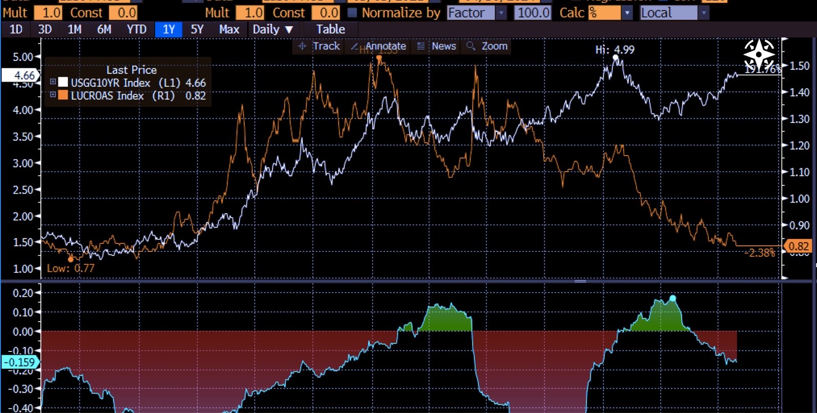
  1. Credit spreads flip into a somewhat negative correlation with UST yields if the sell-off lacks pace – this has been true for the last 2.5 years or so. Unlike the September/Oct 2023 sell-off that shocked the system with its speed (correlation raced higher back then i.e. higher yields triggered higher spreads followed by a collapse later), the current backdrop is not only lower in terms of absolute yields but after a 25bps post-CPI sell-off seems to have stalled. We are at present in a negative correlation zone.


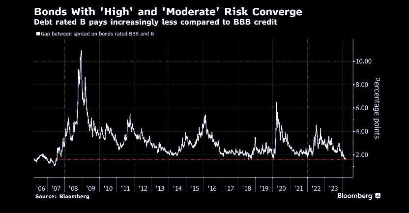
    Coupled with strong inflows into US IG and HY mandates in Q4 23 and slower but still strong in Q1 24, credit investors have focused more on the investment carry aggressively chasing yields lower even for the mispriced credits, mispricing them some more. While Treasury yields have been higher, seems like financial conditions for the credit world have eased. 


    Chart 4 – UST yield and US IG Credit spread Correlation

    Source: Bloomberg

    This indicates neutral to arguably easier financial conditions in a rising inflation backdrop…..

    Source: Bloomberg

    Source: Bloomberg
  1. Among the several surveys being published, this one needs to be flagged again. Low levels of cash/active deployment into this sell-off is another way of exhibiting an investor sentiment that’s wavered between exuberant to constructive for the most part as is visible in equity and credit markets. Bonds on the other hand have actively changed hands from asset managers averse to duration to Pension funds switching out of equities. FWIW – survey guidance for the chart below suggests sub-4% cash levels to be a bear signal for equities. Given the earnings tailwind, we might need some help from higher rates/real yields to realise that.    

  1. Finally – the efficacy of interest rate as a tool for monetary policy is probably at its weakest in history as evidenced by: a) Technology sector adjusted for market cap accounts for over 40% of the S&P 500 weight, light on capital usage with large pools of free cash flows has actually benefited from higher interest rates (higher interest earnings on short term investments), and reported lower net interest payments b) Nearly 60% of Americans have exposure to stocks which indirectly gives them access to higher rates immunity c) impact of higher mortgage rates has also faded at the margin with a higher proportion of cash out refinance/home equity loans versus conventional first time mortgages.


  1. This chart has been quite telling about the impact of the household wealth effect on Q-o-Q% SAAR GDP Personal Consumption Core Price index. Core PCE typically lags changes in household wealth by 2-4 quarters if you’re looking for a better fit of the graph. As per a recent Harvard study on US households, negative/positive income shocks would typically lead to higher marginal propensity to consume (MPC) in the month/quarter of the shock and decline on an average cumulatively for a year thereafter. Irrespective of the heterogeneity of the households the immediate impact of the shock is similar across but peters out (in case of a negative shock) in different ways depending on distribution of wealth/liquidity/asset ownership in the economy. For good order – the MPC stats are smaller both in the impact period and the following period for larger shocks versus smaller shocks.

    Household networth in turn moves almost in tandem with % returns on SPX – I’ll keep that chart out so as not to clutter here. Muted equity returns for a quarter – or even negative returns for a few weeks – could dent sentiment enough to erode some of that discretionary spend/contract real spending. But going back to 1, an implied range on yields and sell-off in rates that’s offset by equities’ own tailwinds (still robust earnings) there’s limited shock value for the latter.

    Chart 3 – % HH Networth and % Q-O-Q GDP Core PCE

  1. Credit spreads flip into a somewhat negative correlation with UST yields if the sell-off lacks pace – this has been true for the last 2.5 years or so. Unlike the September/Oct 2023 sell-off that shocked the system with its speed (correlation raced higher back then i.e. higher yields triggered higher spreads followed by a collapse later), the current backdrop is not only lower in terms of absolute yields but after a 25bps post-CPI sell-off seems to have stalled. We are at present in a negative correlation zone.


    Coupled with strong inflows into US IG and HY mandates in Q4 23 and slower but still strong in Q1 24, credit investors have focused more on the investment carry aggressively chasing yields lower even for the mispriced credits, mispricing them some more. While Treasury yields have been higher, seems like financial conditions for the credit world have eased. 


    Chart 4 – UST yield and US IG Credit spread Correlation

    This indicates neutral to arguably easier financial conditions in a rising inflation backdrop…..

  1. Among the several surveys being published, this one needs to be flagged again. Low levels of cash/active deployment into this sell-off is another way of exhibiting an investor sentiment that’s wavered between exuberant to constructive for the most part as is visible in equity and credit markets. Bonds on the other hand have actively changed hands from asset managers averse to duration to Pension funds switching out of equities. FWIW – survey guidance for the chart below suggests sub-4% cash levels to be a bear signal for equities. Given the earnings tailwind, we might need some help from higher rates/real yields to realise that.    

  1. Finally – the efficacy of interest rate as a tool for monetary policy is probably at its weakest in history as evidenced by: a) Technology sector adjusted for market cap accounts for over 40% of the S&P 500 weight, light on capital usage with large pools of free cash flows has actually benefited from higher interest rates (higher interest earnings on short term investments), and reported lower net interest payments b) Nearly 60% of Americans have exposure to stocks which indirectly gives them access to higher rates immunity c) impact of higher mortgage rates has also faded at the margin with a higher proportion of cash out refinance/home equity loans versus conventional first time mortgages.


  1. This chart has been quite telling about the impact of the household wealth effect on Q-o-Q% SAAR GDP Personal Consumption Core Price index. Core PCE typically lags changes in household wealth by 2-4 quarters if you’re looking for a better fit of the graph. As per a recent Harvard study on US households, negative/positive income shocks would typically lead to higher marginal propensity to consume (MPC) in the month/quarter of the shock and decline on an average cumulatively for a year thereafter. Irrespective of the heterogeneity of the households the immediate impact of the shock is similar across but peters out (in case of a negative shock) in different ways depending on distribution of wealth/liquidity/asset ownership in the economy. For good order – the MPC stats are smaller both in the impact period and the following period for larger shocks versus smaller shocks.Household networth in turn moves almost in tandem with % returns on SPX – I’ll keep that chart out so as not to clutter here. Muted equity returns for a quarter – or even negative returns for a few weeks – could dent sentiment enough to erode some of that discretionary spend/contract real spending. But going back to 1, an implied range on yields and sell-off in rates that’s offset by equities’ own tailwinds (still robust earnings) there’s limited shock value for the latter.

    Chart 3 – % HH Networth and % Q-O-Q GDP Core PCE

  1. Credit spreads flip into a somewhat negative correlation with UST yields if the sell-off lacks pace – this has been true for the last 2.5 years or so. Unlike the September/Oct 2023 sell-off that shocked the system with its speed (correlation raced higher back then i.e. higher yields triggered higher spreads followed by a collapse later), the current backdrop is not only lower in terms of absolute yields but after a 25bps post-CPI sell-off seems to have stalled. We are at present in a negative correlation zone.


    Coupled with strong inflows into US IG and HY mandates in Q4 23 and slower but still strong in Q1 24, credit investors have focused more on the investment carry aggressively chasing yields lower even for the mispriced credits, mispricing them some more. While Treasury yields have been higher, seems like financial conditions for the credit world have eased. 


    Chart 4 – UST yield and US IG Credit spread Correlation

    This indicates neutral to arguably easier financial conditions in a rising inflation backdrop…..

  1. Among the several surveys being published, this one needs to be flagged again. Low levels of cash/active deployment into this sell-off is another way of exhibiting an investor sentiment that’s wavered between exuberant to constructive for the most part as is visible in equity and credit markets. Bonds on the other hand have actively changed hands from asset managers averse to duration to Pension funds switching out of equities. FWIW – survey guidance for the chart below suggests sub-4% cash levels to be a bear signal for equities. Given the earnings tailwind, we might need some help from higher rates/real yields to realise that.    

  1. Finally – the efficacy of interest rate as a tool for monetary policy is probably at its weakest in history as evidenced by: a) Technology sector adjusted for market cap accounts for over 40% of the S&P 500 weight, light on capital usage with large pools of free cash flows has actually benefited from higher interest rates (higher interest earnings on short term investments), and reported lower net interest payments b) Nearly 60% of Americans have exposure to stocks which indirectly gives them access to higher rates immunity c) impact of higher mortgage rates has also faded at the margin with a higher proportion of cash out refinance/home equity loans versus conventional first time mortgages.

To conclude, all of the above validates that neutral rates are well above Fed’s estimated long-term rate of 2.5% and if we are indeed operating in the neutral rate backdrop (4-handle risk-free rates), the 2% inflation target would remain a distant dream if the system isn’t shocked. A more potent cocktail of higher risk-free yields/wider credit spreads/weaker equities and or a stronger dollar would be needed to tighten financial conditions in a manner that dents the sentiment enough for core price pressures to subside. If markets continue to believe Fedspeak, suggesting a hike ‘if needed’ should be the right guidance at this stage. Shock the system now while it can still take it. 

To conclude, all of the above validates that neutral rates are well above Fed’s estimated long-term rate of 2.5% and if we are indeed operating in the neutral rate backdrop (4-handle risk-free rates), the 2% inflation target would remain a distant dream if the system isn’t shocked. A more potent cocktail of higher risk-free yields/wider credit spreads/weaker equities and or a stronger dollar would be needed to tighten financial conditions in a manner that dents the sentiment enough for core price pressures to subside. If markets continue to believe Fedspeak, suggesting a hike ‘if needed’ should be the right guidance at this stage. Shock the system now while it can still take it. 

Register Now for More New Updates

Related Articles

Here are other relevant related resources on this topic

You cannot copy content of this page